Branding
Logo and identity design
Identity and brand manuals
More about the project
Branding
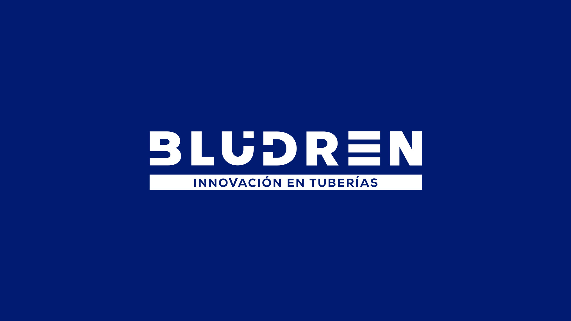
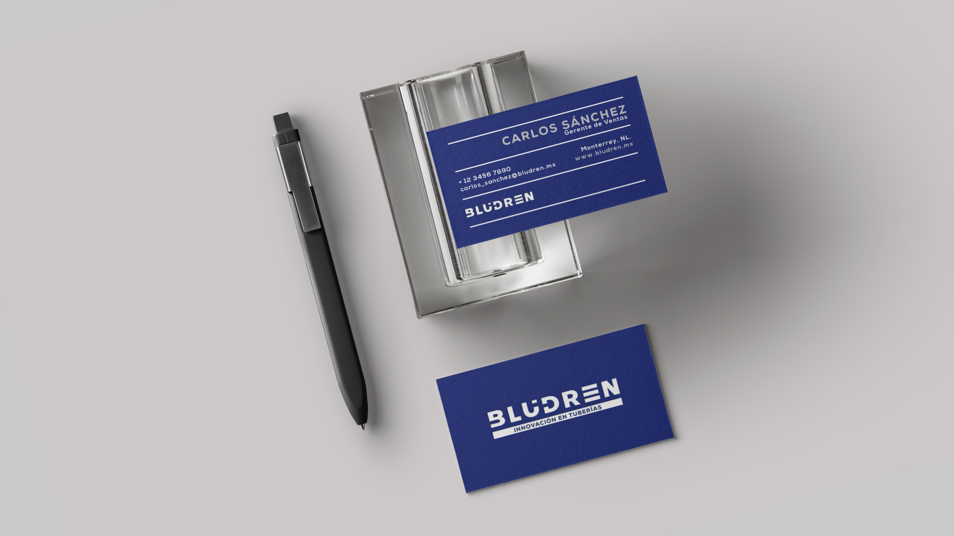
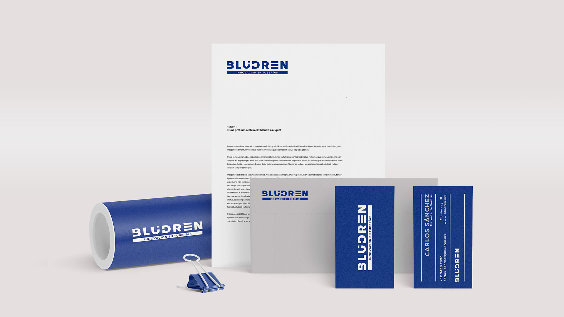
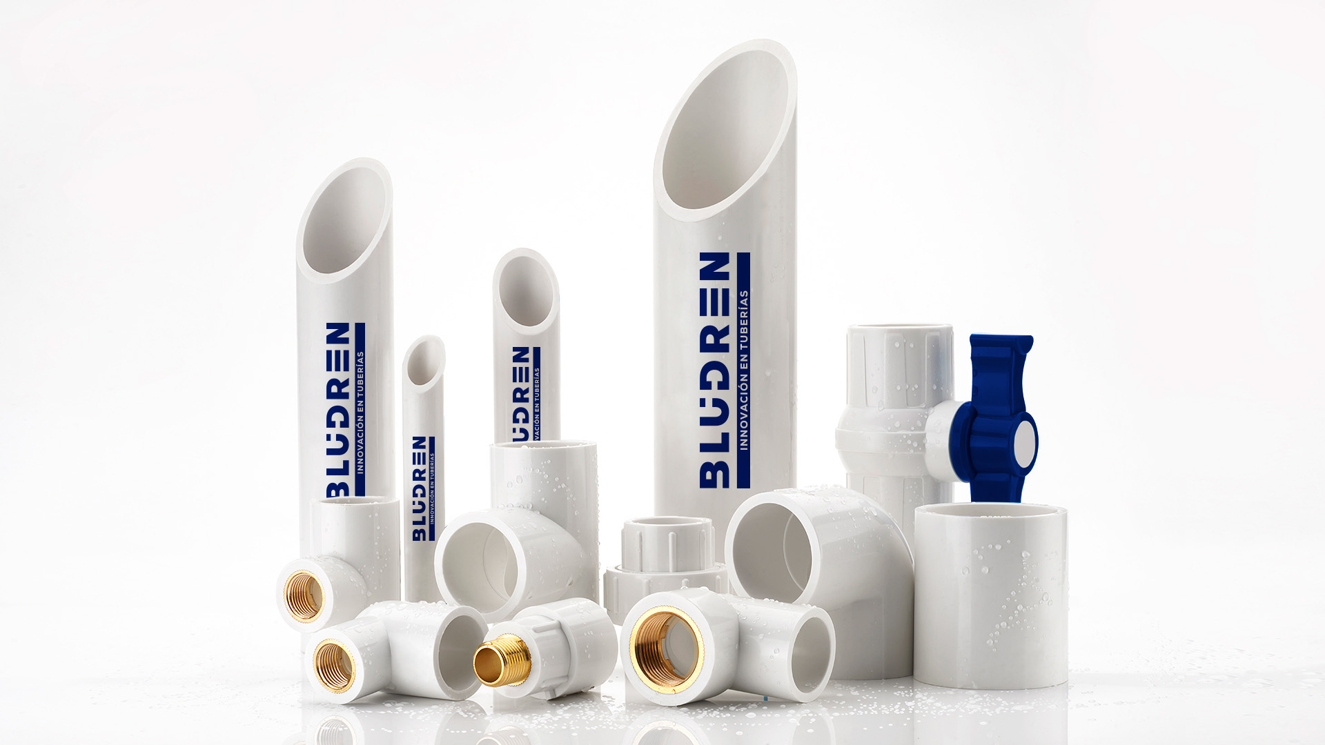
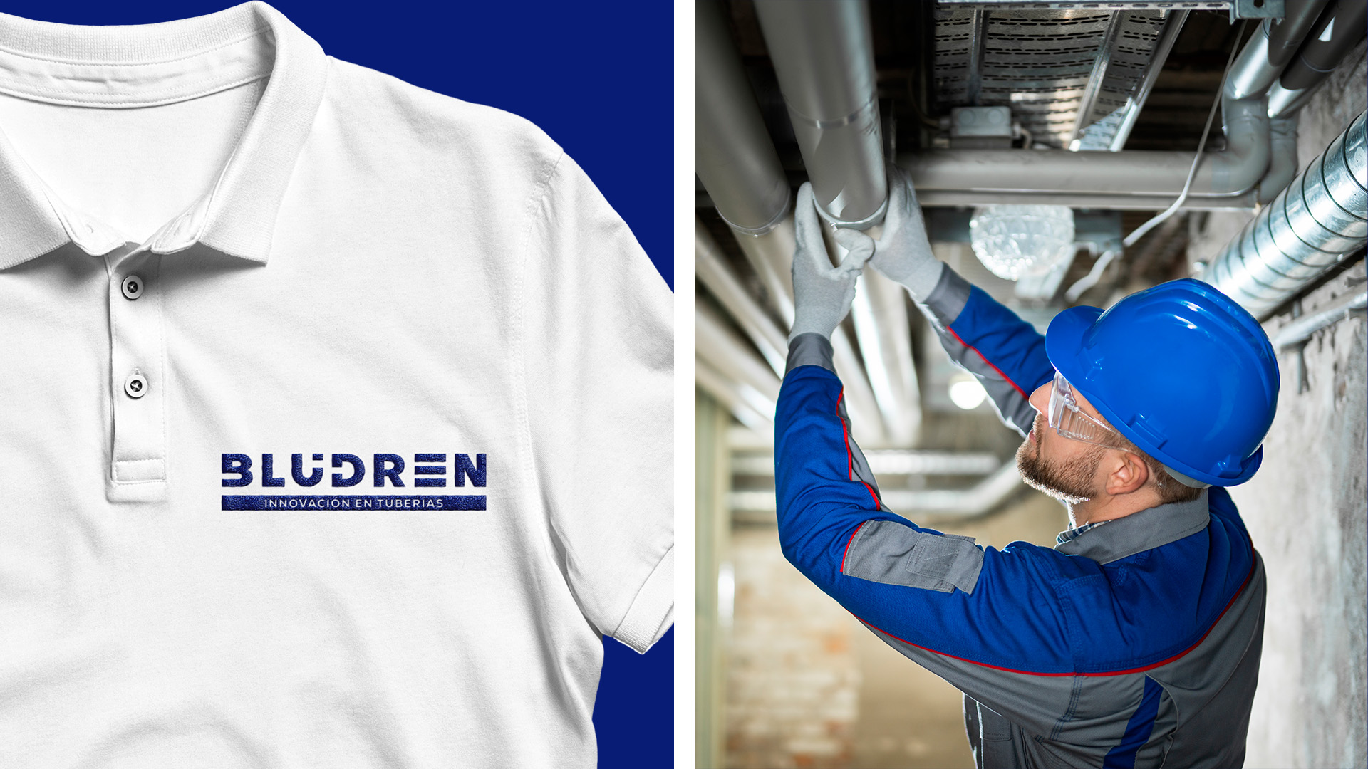
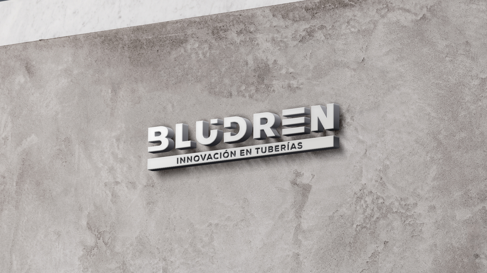
We designed a distinctive typographic logo, deftly reshaping certain letters to cleverly evoke the shape of pipes, without compromising their legibility. The choice of a solid typeface conveys the notion of cohesion and strength. The three lines that make up the emblematic ‘E’ encapsulate the fundamental principles of efficiency: optimization of time, reduction of costs and greater longevity, at the same time making ingenious reference to the main product: pipes. The blue color interplay symbolizes our technological prowess and embodies our innovative spirit.


