Branding
Logo and identity design
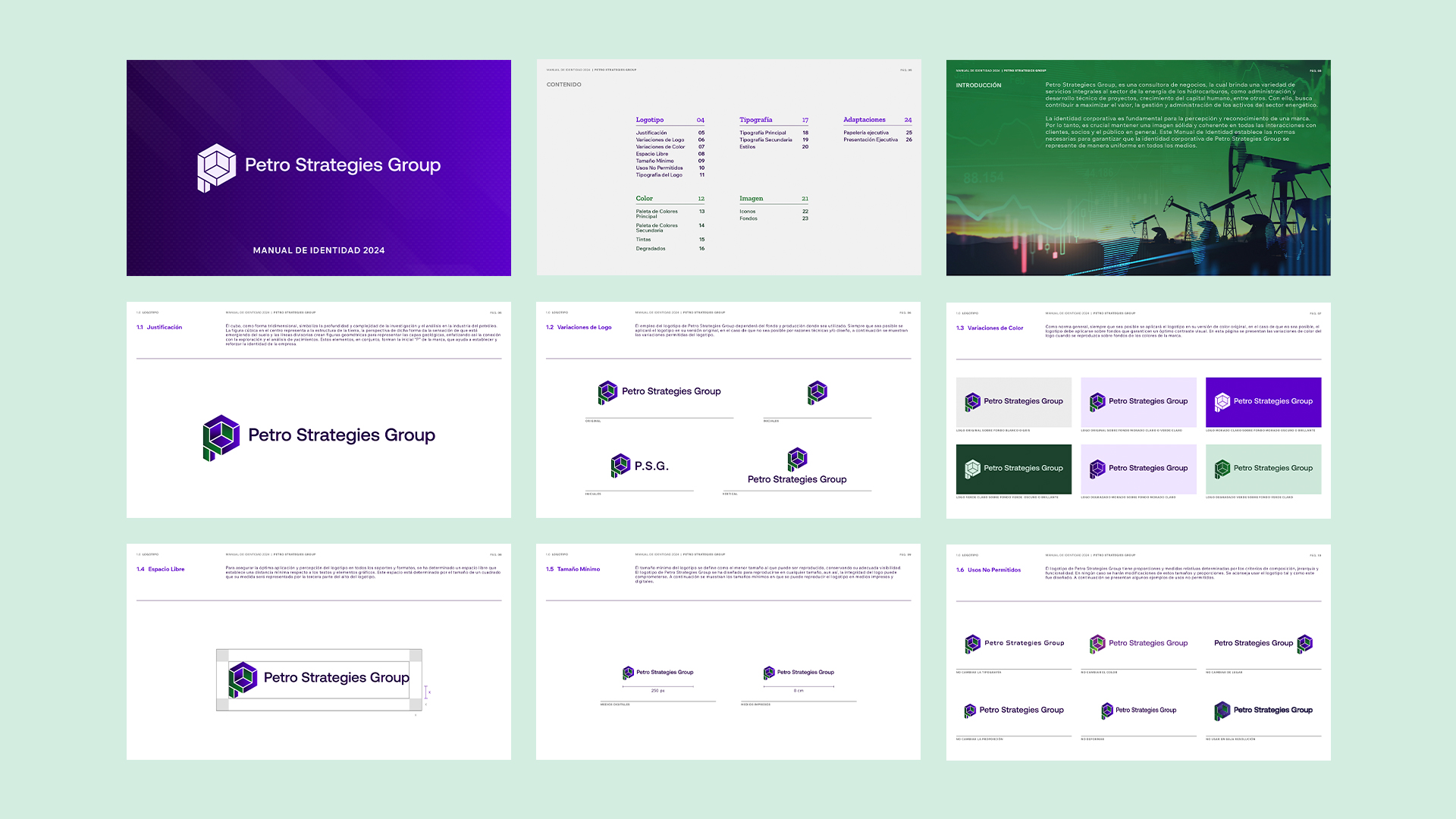
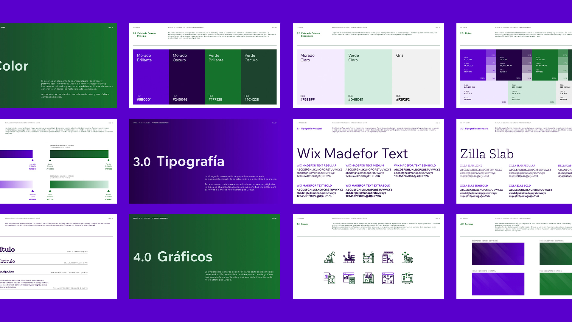
Brand guidelines
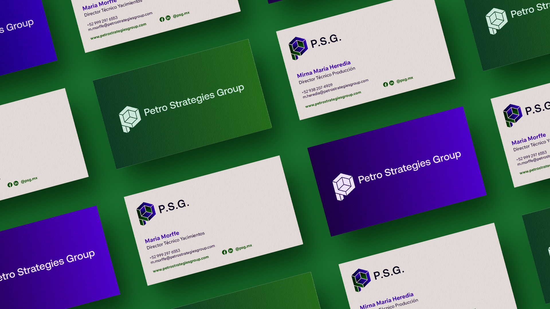
Brand assets design
Web
User Experience Design (UX)
Interface design (UI)
Website development on WordPress
More about the project
Branding
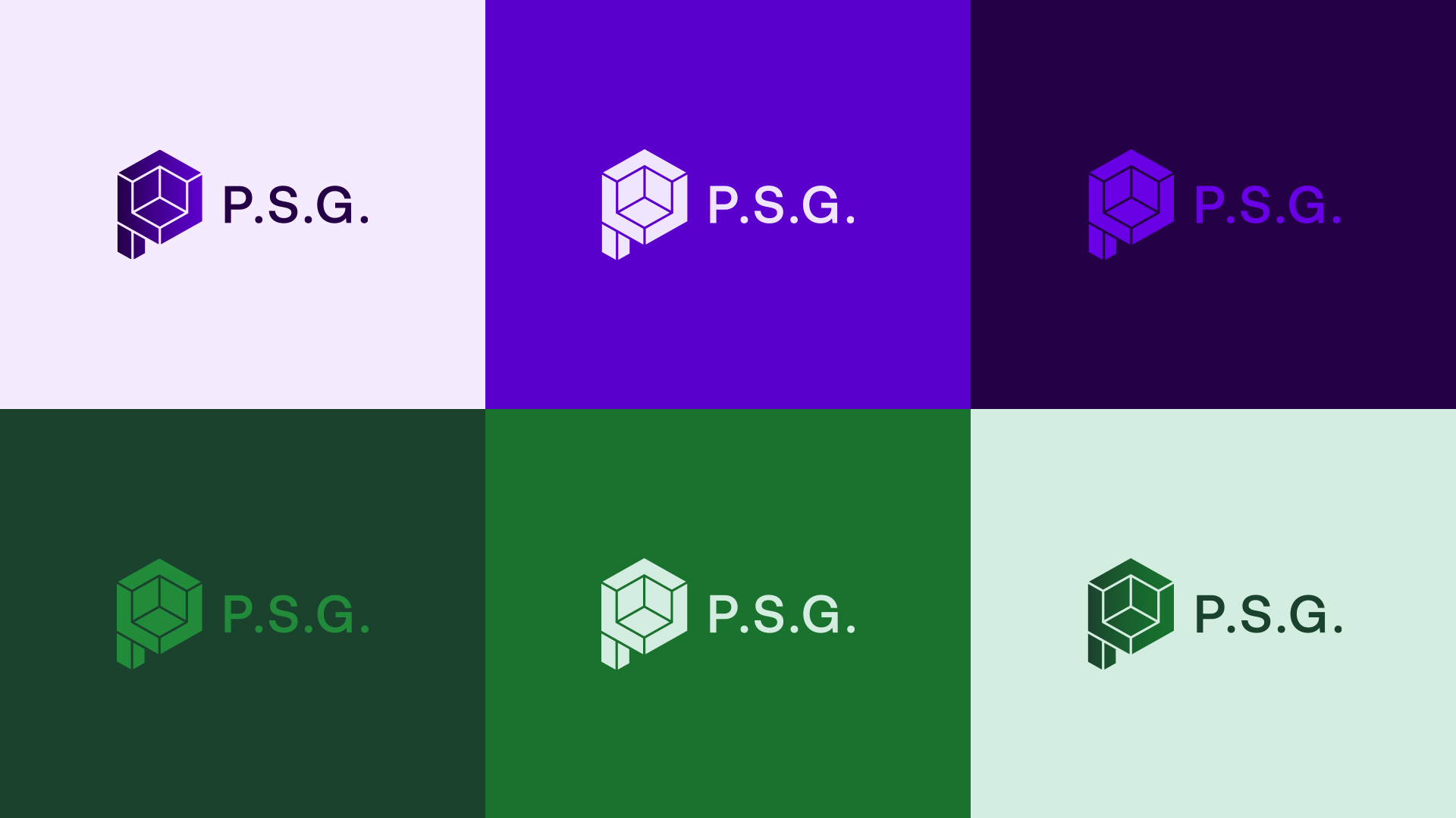
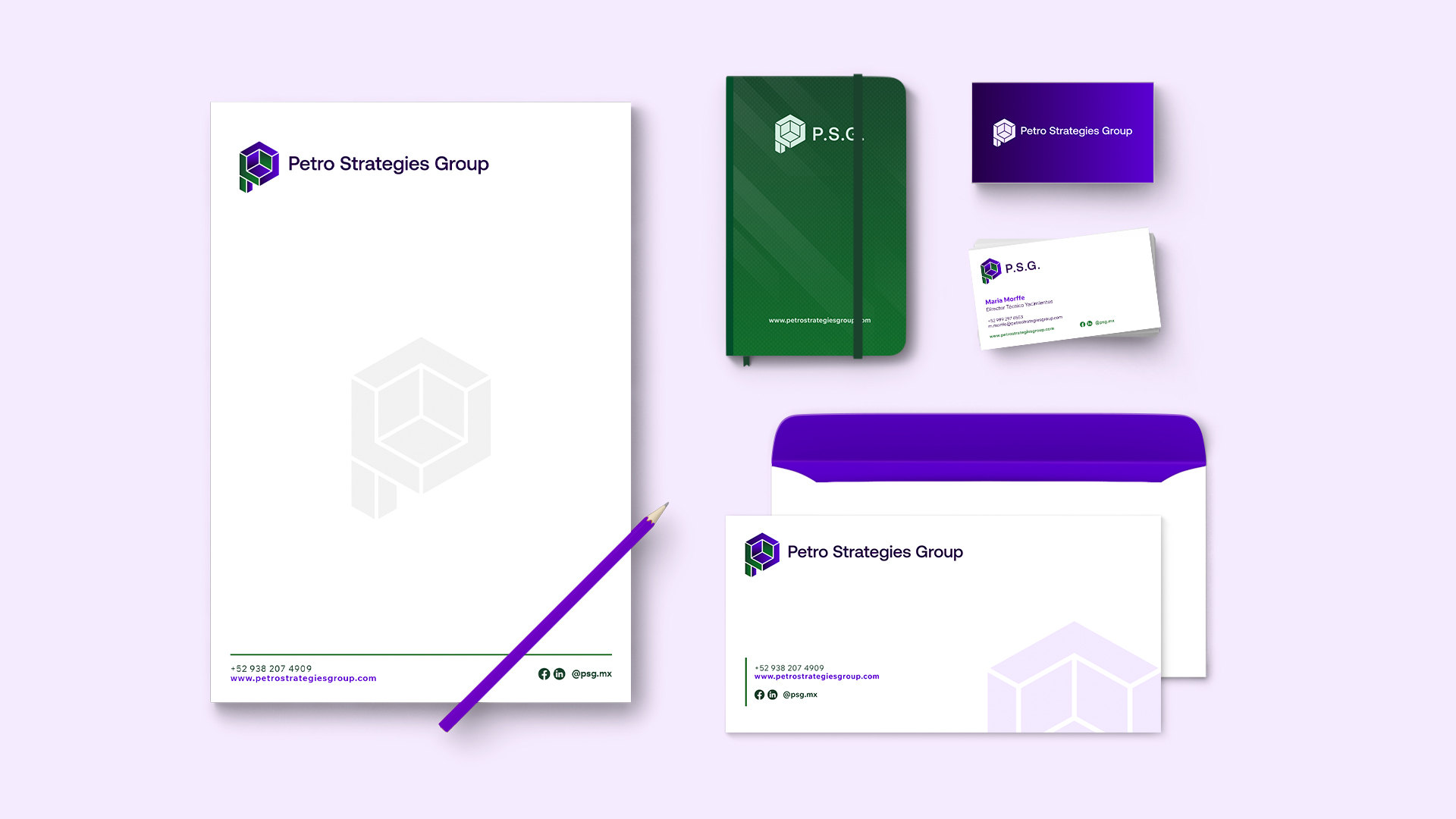
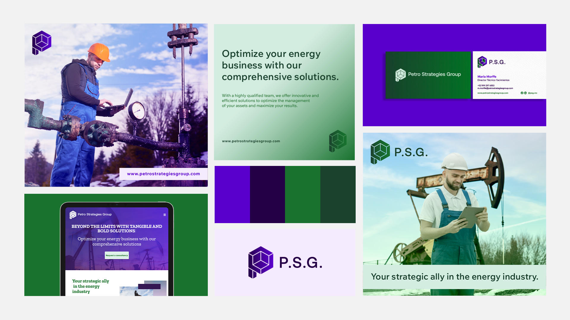
The visual identity is centered around a cube-based icon. As a three-dimensional form, the cube represents the depth and complexity of research, analysis, and strategic thinking inherent to the oil and gas industry. The central cubic shape symbolizes the structure of the earth, while its perspective suggests emergence from the ground. The dividing lines within the cube form geometric shapes that reference geological layers, reinforcing the brand’s connection to exploration and reservoir analysis. Together, these elements subtly construct the initial “P,” strengthening brand recognition and identity.
The color palette was carefully selected to further support the brand’s positioning. Purple conveys innovation, expertise, and advanced technology in reservoir analysis, while green establishes a visual connection to the earth and natural resources. This combination differentiates the brand while projecting modernity and technical sophistication within the energy sector.
Web
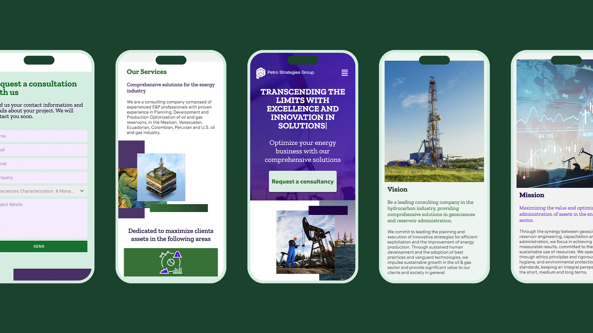
To support the launch of the brand, we also designed and developed a clear, informative one-page website. Focused on simplicity and usability, the website serves as Petro Strategics Group’s first digital touchpoint, with the primary goal of capturing leads for upcoming national and international projects.

branding-kiwii-psg_03

branding-kiwii-psg_02

branding-kiwii-psg_04
branding-kiwii-psg_05
branding-kiwii-psg_06
branding-kiwii-psg_07

branding-kiwii-psg_08
branding-kiwii-psg_09
branding-kiwii-psg_10
branding-kiwii-psg_12
branding-kiwii-psg_13